Magical Realism in Kelly’s Work for Peppered Labs
We just launched a newly refreshed brand for Peppered Labs, the brand strategy agency run by our brilliant friend Natalie, and I want to talk a little about Kelly’s work on it because I think the way she blends visuals of nature with neon embellishments is a great example of why I frequently describe Kelly’s design work as “magical realism.”
Natalie does a lot of exceptionally smart, creative work, solving big growth problems for businesses everywhere, but with a strong focus on the community of Colorado’s Western Slope, where she is very highly regarded. Every word on the website can tell you that if you read it, but I think Kelly’s particular brand of magic is that an image like this also kind of says it all:

I first encountered magical realism in literature, but the concept of letting a realistic setting be invaded by the fantastic has a broad tradition across art forms. I love that we get to use the approach in branding because the mashups and juxtapositions and overall effects of the style are often evocative, eliciting emotions that feel accurate even if the image or story is full of abstraction.
Talking about branding is always at risk of feeling abstract, and we’re constantly seeking to ground our work in real-life concerns like those outlined by Natalie in Peppered Labs’ very smart “SPICE Framework”: Strategy, Positioning, Identity, Clarity, and Execution.
We do a lot in our Soul Search to understand those points for a business, and then Kelly has a knack for discovering the design that feels like it is expressing a brand’s personality while also carrying out its strategy effectively.
I say discovering because I have the privilege of watching her design, and being asked for feedback on working drafts. I love that her design practice is roll-up-your-sleeves trial and error until the image on the screen matches the vision in her mind matches the needs of the client.
For every perfect homepage hero image of a mountain’s crags intersecting with a line graph, I have also seen glowing rivers that are unclear metaphors, aerial shots of neon fields that distract, and spiraling landscapes that didn’t quite hit the mark. I don’t say this to diminish Kelly’s work. In fact, I feel the opposite. Kelly usually generates a big concept, and then so many little ideas within that concept that it becomes fun to discuss what each one is conveying, and the sheer volume of ideas is always impressive.
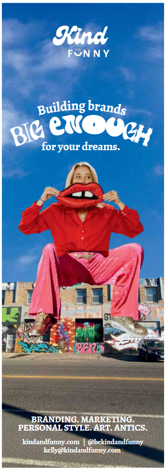
I also think the things Kelly designs are just plain fun, too, while they convey the message they intend. For example, this magazine ad is another version of the same style—hand-crafted digital art that steps outside the expected but still retains a smart, human touch:
At the end of the day, it’s pretty fun working with a partner who sees things wildly and in wild ways, and has the skills to bring those visions to life.
If you need a little magical realism in your business to create a brand big enough for all of your many dreams, I know just the designer for you …


Do you have an overarching artistic style? Need a brand with a design that’s just for you? jed@kindandfunny.com.